Your first sourdough loaf
An example introduction to caring for a starter and getting to know your dough.
- Who the course is for
- Skills you will practise
- Confirmed format and duration

The Miha Baking design system for sourdough learning. One soft background, our signature brown, generous curves, and a welcoming path from curiosity to confidence.
Friendly, patient and personal. The visual language should feel as approachable as learning to bake alongside someone who wants you to succeed.
The primary logo
Use the supplied artwork unchanged. Keep its proportions, original colours and clear space. Never redraw the wordmark as ordinary text.
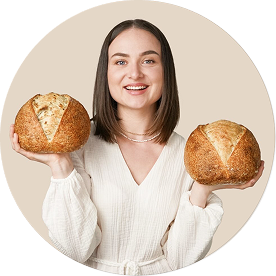

The portrait introduces the teacher. The monogram works as a compact brand mark. The outline profile icon represents an account action.
Suggested web clear space: one quarter of the logo height on every side. Logo width: 220–280 px on desktop and 180–220 px on mobile. This numeric rule extends the clear-space diagram in the source PDF.
The whole experience shares the same soft background, from navigation to footer. Hierarchy comes from size, weight, spacing and shape—not different text colours.
#F1F1F1Page, sections, cards, fields, modal and footer.
#987C67Headings, paragraphs, text links and labels. Buttons use #FFFFFF.
#FF8C10Primary button fill and selected emphasis.
#E0E0E0Decorative dividers and surface outlines.
| Element | Background | Text |
|---|---|---|
| Page, navigation and footer | #F1F1F1 | #987C67 |
| Cards, inputs and dialog | #F1F1F1 | #987C67 |
| Primary button | #FF8C10 | #FFFFFF |
| Secondary button | #F1F1F1 | #FFFFFF |
| Help, placeholders and status messages | #F1F1F1 | #987C67 |
Contrast reference: brown on the universal background is approximately 3.43:1, and white on orange is approximately 2.33:1. This requested palette does not meet the 4.5:1 WCAG AA threshold for normal text; larger type alone does not resolve the button pairing. The guide preserves the specified colours and does not claim AA compliance. WCAG contrast reference.
Glodok is the preferred display face for large, short headlines. Roboto brings clarity to paragraphs, smaller headings and controls. Page text uses #987C67. All button labels use #FFFFFF, including every interaction state.
Learn to care for your starter, understand your dough and enjoy the rhythm of sourdough baking.
Display font: checking availability…
ABCDEFGHIJKLMNOPQRSTUVWXYZ
abcdefghijklmnopqrstuvwxyz · 0123456789
| Role | Desktop / mobile | Typeface & weight | Line height |
|---|---|---|---|
| H1 / short display | 64 / 36 px | Glodok; Roboto 500 fallback | 1.12 |
| H2 / large section title | 40 / 28 px | Glodok; Roboto 500 fallback | 1.2 |
| H3 / card title | 24 / 22 px | Roboto Medium 500 | 1.3 |
| Introduction | 20 / 18 px | Roboto Regular 400 | 1.5 |
| Body | 16–18 / 16 px | Roboto Regular 400 | 1.6 |
| Buttons | 16 / 16 px | Roboto Medium 500 | 1.4 |
| Labels & captions | 14 / 14 px | Roboto 400–500 | 1.5 |
Roundness is a core brand characteristic. Use continuous curves and comfortable spacing so the interface feels open, kind and easy to approach.
Buttons are fully rounded pills in every state. Circular icon buttons keep a minimum 48 × 48 px target.
Standard course, pricing and content cards have generously rounded corners. Leave 24–32 px inside.
Image frames and hero compositions use extra-soft corners. Circular portraits use a 50% radius.
| Viewport | Container / outer margins | Columns / gap | Landing section spacing |
|---|---|---|---|
| 960 px and above | Up to 1200 px / 40 px | 12 / 24 px | 80–96 px |
| 640–959 px | Viewport minus 48 px | 8 / 24 px | 64 px |
| 320–639 px | Viewport minus 40 px | 4 / 16 px | 40–48 px |
Inputs and notices: 24 px. Dialog: 40 px. Cards and hero layouts stack into one column on phones; the primary hero button fills the available width. This reference catalog uses compact 56 px desktop section spacing. Avoid fixed content heights and absolute positioning for text.
Use a clear action verb and one primary action per group. All button states retain pill-shaped corners and white (#FFFFFF) text.
Primary: orange fill with white text. Secondary: brown outline with white text on the universal background. Text link: brown with an underline.
Icons are 20–24 px inside at least 48 × 48 px controls. Every icon-only button has an accessible name and visible keyboard focus.
The state samples are static. Hover fill: #E97A00; pressed fill: #D36E00; focus ring: 2 px brown with a 4 px offset. All button labels stay white in default, hover, pressed, focus, disabled and loading states. During real submissions, prevent duplicate requests and set aria-busy.
Keep labels visible, questions simple and error messages helpful. Inputs share the page background, curved edges and signature brown text.
Use a visible error label and a stronger border instead of changing text colour. A live form needs a connected submission service and the appropriate privacy information. Never preselect consent.
Rounded cards hold one clear idea at a time. Their background blends into the page; fine outlines and generous padding establish their shape.
An example introduction to caring for a starter and getting to know your dough.
Add the confirmed total price and purchase terms before publishing.
Pair a helpful title with a short introduction. A live article card can include a rounded image, category and reading time.
This is a card template; an article is not linked yet.“Place a real student’s words about their learning experience here.”
Name · course · date · portrait with permission. Replace this template before publication; do not invent quotations, ratings or student results.
Bring the system together around one course and a clear next step. This hero is a composition example, not a final course offer.
Get to know your starter, understand your dough and find a baking rhythm that feels like you.
| Section | Contents | Design rule |
|---|---|---|
| Header | Logo, 3–5 anchors, account link if available | Collapsible mobile navigation; only working destinations |
| Hero | One H1, learning benefit, primary CTA, portrait | Short headline, soft media frame, shared background |
| Who it’s for | 3–4 starting points and learning goals | Short, friendly statements |
| Meet the teacher | Portrait, personal story, verified experience | Real facts and a generously rounded image |
| Course outline | Numbered modules or accordion | A topic and learning purpose for each module |
| How learning works | 3–4 steps | Confirmed format, access and feedback |
| Student work | 4:3 photos with captions | Real work and permission to share |
| Testimonials | Quote, author, course and source | No invented social proof |
| Pricing | Total price, currency, content, access, CTA | Use the same pill button and card system |
| FAQ | 5–8 purchase questions | Native details; multiple answers may stay open |
| Final invitation | Short invitation and form or link | Repeat the same primary goal |
| Footer | Contact details, documents and social links | Same background and brown text |
| Optional additions | Video, comparison, gift or cookie notice | Only when supported by actual content or services |
Module topics and count illustrate the layout only.
The live course page should state the actual starting level. This answer demonstrates the accordion interaction.
Add the confirmed access period and any renewal conditions.
List the essential and optional equipment for the specific course.
Every state should explain what happened and what comes next. Keep text brown; distinguish messages with wording, icons and border treatment.
Natural light, honest textures and an approachable teacher. Rounded frames bring photography into the same friendly visual language as the controls.
Use natural side lighting, simple surroundings and real crumb and crust textures. Show the teacher, hands and the baking process.
Course images: 4:3. Portraits: 1:1 or 4:5. Video: 16:9. Image corners: 48 px; circles: 50%. Keep logos uncropped.
Use WebP or AVIF for new photography, responsive sizes and explicit dimensions. Load the first hero image immediately and lower images lazily.
Do not stretch the supplied portrait into a full-screen photo. Check the monogram separately at 16 and 32 px for favicon use.
Warm, specific and encouraging: “Let’s learn what your dough is telling you.”
Avoid guaranteed results, false countdowns and invented scarcity. All guide copy, examples, labels, validation and documentation are in English.
The visual catalog is packaged as one T123 fragment. The future landing page can follow the same structure, with forms, payments and course access connected separately.
This inserts the reference catalog. It is not a connected sales page.
| Before launching | Implementation requirement |
|---|---|
| Brand consistency | Use #F1F1F1 on all page surfaces, #987C67 for page text, #FFFFFF for all button labels, and the documented rounded shapes. |
| Glodok delivery | The font is embedded in the HTML. Replace the old T123 contents in full, republish, and verify the display font on the published page. |
| Enquiry forms | Connect a native Tilda form or secure external handler. Custom HTML alone does not connect to Tilda form services. |
| Payments and access | Verify payment confirmation and access delivery; never put secret keys in the HTML. |
| Search and sharing | Set title, description, favicon, social metadata and page language in Tilda; use one H1 in the landing page. |
| Responsive behaviour | Check 320, 390, 768 and 1440 px, 200% text resizing, keyboard interaction and focus visibility. |
| Performance | Suggested image budget: hero up to 250 KB, lower images up to 150 KB, while preserving quality. Measure actual assets. |
| CSS isolation | Keep the mb- prefix and root ID. Do not apply resets to Tilda classes or unrelated elements. |
| Reliability | Unique IDs, one initialization and no console errors. Test integrations on the published Tilda page. |
| Content | Replace all demonstration copy with verified course details, pricing, testimonials, contact information and documents. |
#miha-site {
  --mb-surface: #F1F1F1;
  --mb-paper: #F1F1F1;
  --mb-ink: #987C67;
  --mb-muted: #987C67;
  --mb-logo: #987C67;
  --mb-cta: #FF8C10;
  --mb-button-text: #FFFFFF;
  --mb-line: #E0E0E0;
  --mb-radius: 32px;
  --mb-control-radius: 999px;
  --mb-font-display: Glodok, Roboto, Arial, sans-serif;
  font-family: Roboto, Arial, sans-serif;
  color: var(--mb-ink);
  background: var(--mb-surface);
}